


Bedroom Paint Color Ideas: 8 Palettes for Better Sleep and Style (2026)
Bedroom paint color is the room’s emotional thermostat: the right color lowers the heart rate, deepens the sleep, and makes the mornings gentler. The wrong color — the rental beige that depresses, the stark white that glares, the bold red that stimulates — works against the rest the room should serve. Yet most bedrooms wear whatever the last owner chose, the color as afterthought rather than intention.
This guide presents eight bedroom paint palettes — each with the psychology, the specific colors, the lighting notes, and the coordination guide. You’ll get a palette comparison table, the sampling and painting toolkit, a color-psychology spotlight, mistakes that ruin bedroom paint, and answers to common questions. The walls are the room’s largest surface; their color is the room’s largest decision. For the full transformation, see our small living room ideas.
Paint Planning: Sampling, Light, and Coordination
Sample like a professional: buy large swatches or sample pots ($5–$10 each) of the finalists, paint 2×2-foot sections on the bed wall and one secondary wall, and live with them for three days — viewing in morning, afternoon, and evening light, with the bedding nearby. The bedroom’s light is the variable: the northern light (cool, consistent — colors read truer but cooler), the southern (warm, shifting — colors glow), the eastern (bright morning, dim afternoon), the western (dim morning, warm evening). The color that looks perfect at noon can fail at 7 PM — the three-day test reveals the truth.
Coordinate the palette’s elements: the wall color (the decision), the ceiling (the 50-percent-lighter version of the wall, or the soft white — the fifth wall considered), the trim (the crisp white or the wall color — the modern monochrome), the bedding (the palette’s partner — the coordination, not the match), and the undertone harmony (the wall’s undertone — warm or cool — must agree with the fixed elements: the flooring, the furniture wood — the undertone clash is the subtle discord). Set the budget ($40–$60 per room — the paint plus supplies), the timeline (the weekend — the prep Saturday, the painting Sunday), and the sequence (the declutter first, the ceiling then walls then trim).
8 Bedroom Paint Palettes
From serene blues to cocooning charcoals, these eight palettes cover every sleep style — each with the psychology and the specifics.
Step 1: 1. Serene Blue: The Sleep Classic
The palette: the soft blues — the misty, dusty, watery tones (think Benjamin Moore’s Palladian Blue, Sherwin-Williams’ Sea Salt’s blue cousin) — the colors that lower heart rates and blood pressure measurably. The psychology: blue is the most universally calming color, associated with the sky and water — the evolutionary calm. The sleep studies consistently rank blue bedrooms among the best for rest quality.
The specifics: choose the muted, grayed blues (the serene — not the primary, not the electric — the dusty tones that recede), pair with white trim (the crisp contrast — the coastal calm) and natural wood (the warmth — the balance), and coordinate bedding in white, soft gray, or the deeper blue (the tonal layering). The northern-light note: blues read cooler in northern light — choose the warmer blue-gray to compensate. The finish: eggshell (the soft sheen — the bedroom’s standard, the wipeable calm).
This palette suits the anxious, the hot sleepers (the cool psychological temperature), and anyone whose days are high-stimulation — the blue bedroom as the calm counterpoint. It’s the safest bedroom color (the universal appeal — the resale-friendly), the most researched (the sleep studies), and the most forgiving (the muted blues harmonize with everything). The sleep classic for the reasons: it works, measurably, on the body as well as the eyes.
Step 2: 2. Sage Green: The Natural Calm
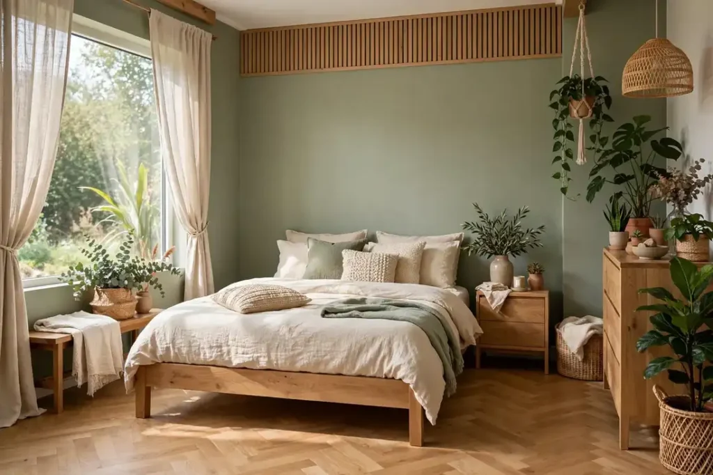
The palette: the soft sages — the grayed greens (the herbal, the eucalyptus, the misty garden) — the colors of nature indoors. The psychology: green is the restful color (the eye focuses green most easily — the least strain), associated with the natural world — the biophilic calm. The 2026 dominance: sage is the decade’s neutral, the green that goes with everything.
The specifics: the grayed sages (not the minty, not the forest — the muted middle that reads as neutral), the warm white trim (the softness — the stark white fights the sage’s warmth), the natural wood and plants (the biophilic layering — the green walls with the green plants, the nature doubled), and the bedding in white, cream, or the deeper green (the tonal). The light note: sage is the chameleon — it shifts with the light (grayer in cool, warmer in warm) — the three-day sample essential.
This palette suits the nature lovers, the stressed (the biophilic stress reduction is researched), and the design-conscious (the 2026 currency). It pairs with the organic-modern style (the linen, the oak — the natural composition) and the cottage (the garden palette). The sage bedroom is the nature prescription — the walls as the daily dose of the outdoors. The most livable green: calm without the cave, natural without the theme.
Step 3: 3. Warm White: The Soft Glow
The palette: the warm whites — the creamy, linen, alabaster tones (not the stark, not the yellow — the soft warmth that glows). The psychology: white is the clarity (the clean slate, the spaciousness), warmed to avoid the institutional — the cozy minimalism. The light-maximizing: warm white reflects the most light (the small/dark bedroom’s ally) while feeling soft, not stark.
The specifics: the warm undertone (the yellow-beige-pink warmth — test against the fixed elements; the undertone must harmonize), the texture layering (the warm white needs the linen, wool, and wood — the flat white fails without texture), the contrast (the dark accents — the black frames, the wood tones — the definition that prevents the washout), and the bedding (the white-on-white with texture — the hotel luxury — the varied whites, not the matched). The trim: the same warm white (the monochrome — the seamless) or the brighter white (the subtle definition).
This palette suits the minimalists, the small/dark bedrooms (the light-maximizing), and the rental-friendly (the safe, the landlord-approved). The discipline: the warm white bedroom lives or dies on texture and contrast — the flat, textureless warm white is the boring beige’s cousin. Layer the textiles, add the dark accents, include the wood — the warm white as the canvas, the textures as the art. The soft glow: the bedroom as the luminous calm.
Step 4: 4. Cocooning Charcoal: The Bold Calm
The palette: the deep charcoals, soft blacks, dark slate — the cocooning darks that envelop. The psychology: the dark bedroom as the cave (the evolutionary shelter — the safety feeling), the intimacy (the boundaries blurred — the room feels embracing), the sleep (the darkness-aligned — the melatonin-friendly). The 2026 evolution: the warm charcoals (the brown-black, not the blue-black — the inviting dark).
The specifics: the warm dark (the undertone warm — the brown or umber base — the dark that hugs), the lighting multiplication (the dark walls absorb light — the layers doubled: the bedside, the accent, the overhead dimmed — the dark room needs more light, not less), the metallic accents (the brass, the gold — the gleam against the dark — the jewelry), and the ceiling (the light — the contrast that prevents the oppression — or the dark for the full cocoon, with the adequate lighting). The bedding: the light (the white or cream — the contrast — the bed as the luminous center) or the tonal dark (the full cocoon — the enveloped).
This palette suits the bold, the night owls (the darkness-aligned), the bright rooms (the dark tames the glare), and the romantics (the intimacy). The fear (the small feeling) is overstated — the dark blurs boundaries, and the adequate lighting keeps it embracing, not oppressive. The three-day sample is critical (the dark shifts dramatically with light). The bold calm: the bedroom as the midnight sanctuary — the drama in service of the deepest rest.

Step 5: 5. Dusty Rose: The Gentle Warmth
The palette: the muted roses — the dusty, clay, plaster tones (not the pink — the grown-up rose, the grayed warmth). The psychology: the nurturing (the warmth, the comfort — the embrace color), the romance (the soft — the flattering light it creates), the calm energy (the warm without the stimulation). The sophistication: the dusty rose is the neutral-warm — the background that flatters everything.
The specifics: the grayed rose (the dustiness — the sophistication; the clear pink is the child’s room), the complementary greens (the sage accents — the natural pairing — the rose-and-sage garden), the warm metals (the brass — the glow), and the bedding (the white, cream, or the deeper rose — the tonal romance). The light note: the rose glows in the warm evening light (the magic hour — the bedroom’s best moment) and stays soft in the morning. The finish: eggshell (the soft — the flat enough for the calm).
This palette suits the romantics, the cold rooms (the psychological warmth), and the couple’s bedrooms (the flattering — the rose light loves skin). It pairs with the cottage (the garden), the traditional (the classic rose), and the organic-modern (the clay). The gentle warmth: the bedroom as the embrace — the color that hugs. The most flattering bedroom color — the walls that make everyone look good.
Step 6: 6. Greige: The Perfect Neutral
The palette: the greiges — the gray-beiges, the warm grays, the perfect neutrals (the balanced middle — neither cold nor warm, the chameleon). The psychology: the neutral as the calm (the non-color — the visual rest), the versatile (the background for everything — the art, the textiles, the life). The practicality: the greige goes with the fixed elements (the flooring, the furniture — the undertone bridge).
The specifics: the undertone decision (the warm greige — the beige-leaning — or the cool — the gray-leaning — matched to the fixed elements’ undertones), the depth (the mid-tone — the definition without the dark — or the pale for the airy), the trim (the white — the crisp — or the tonal), and the accent freedom (the greige takes any accent — the terracotta, the navy, the sage — the neutral’s gift). The light note: the greige shifts with light (the chameleon — the three-day test), reading warmer in warm light, cooler in cool.
This palette suits the undecided (the safe — the universally livable), the resale-conscious (the broad appeal), and the accent-lovers (the neutral background for the colorful textiles and art). The discipline: the greige needs the accents and texture (the flat greige alone is the boring — the styled greige is the sophisticated). It’s the perfect neutral — the background that lets the life be the color. The versatile calm: the bedroom that goes with everything, including the future.
Step 7: 7. Terracotta Clay: The Earthy Energy
The palette: the warm clays — the terracotta, adobe, baked earth (the sun-warmed — the Mediterranean, the desert). The psychology: the grounding (the earth — the stability feeling), the warmth (the cold room’s remedy — the psychological heating), the energy-calm (the warm without the red’s stimulation — the earthy vitality). The 2026 warmth trend: the clay tones are the year’s embrace.
The specifics: the muted clay (the dustiness — the sophistication; the bright terracotta is the restaurant), the natural pairings (the wood, the linen, the plants — the earthy composition), the white trim (the crisp — the definition), and the bedding (the white, cream, or the deep rust — the tonal earth). The light note: the clay glows in the warm light (the sunset walls — the magic) and grounds in the cool. The application: the all-walls (the enveloping warmth) or the bed-wall accent (the focal earth — the safer commitment).
This palette suits the cold climates (the psychological warmth), the earthy styles (the organic-modern, the boho, the Mediterranean), and the bold-warm (the color lovers who find the neutrals cold). It pairs with the natural materials (the clay walls with the oak and linen — the earth composition). The earthy energy: the bedroom as the warm ground — the color that holds. The most warming bedroom color — the walls as the hearth.
Step 8: 8. Moody Navy: The Classic Depth
The palette: the deep navies — the ink, midnight, hale (the blue-black depths — the classic dark). The psychology: the depth (the night sky — the contemplative), the trust (the blue’s reliability, deepened), the sleep (the dark-aligned — the melatonin-friendly, the blue’s calm in the dark register). The timelessness: navy is the eternal — the never-dated dark.
The specifics: the true navy (the blue-dominant — not the charcoal-blue — the depth that’s clearly blue), the white contrast (the crisp — the nautical classic — or the warm white for the softer), the brass accents (the gleam — the maritime luxury), and the bedding (the white — the striking contrast — the bed as the bright ship on the dark sea). The light note: the navy needs the lighting (the dark absorbs — the layers essential), and it glows in the warm evening (the depth illuminated). The ceiling: the white (the lift — the contrast).
This palette suits the traditionalists (the classic — the never-dated), the preppy (the nautical), and the depth-lovers (the dark without the charcoal’s edge). It pairs with the white (the crisp), the brass (the luxury), and the natural wood (the warmth). The moody navy is the gentleman’s dark — the depth with the manners. The classic depth: the bedroom as the midnight sea — the timeless enveloping.
Bedroom Paint Palettes Compared
Each palette’s mood, sleep benefit, lighting need, and best pairing.
| Palette | Mood | Sleep Benefit | Needs Extra Light? |
|---|---|---|---|
| Serene blue | Calming, classic | Lowers heart rate | No |
| Sage green | Natural, restful | Biophilic calm | No |
| Warm white | Bright, soft | Light-maximizing | No (reflects) |
| Cocooning charcoal | Intimate, bold | Cave-like darkness | Yes — double layers |
| Dusty rose | Nurturing, romantic | Flattering warmth | No |
| Greige neutral | Versatile, calm | Visual rest | No |
| Terracotta clay | Grounding, warm | Psychological warmth | No |
| Moody navy | Deep, timeless | Dark-aligned calm | Yes — essential |
Bedroom Paint Toolkit
Everything for the perfect bedroom paint job — the sampling to the finishing.
- Sample pots (3–4 finalists): The $5–$10 each truth-tellers: the 2×2-foot sections, the three-day test, the morning/evening viewing. The sampling is the decision; the paint is the execution.
- Large swatch boards: The movable sampling: paint the boards, move them around the room — the light-variable test. The $5 foam boards that prevent the $50 mistake.
- Painter’s tape (quality): The crisp lines: the ceiling, trim, and window cut-ins. The quality tape (the clean release) is the professional edge — the cheap tape bleeds.
- Angled brush (2.5″): The cutting-in: the edges, corners, and trim. The quality angled brush is the line between the DIY and the professional.
- Roller + covers (3/8″ nap): The wall rolling: the even coverage, the two-coat standard. The 3/8-inch nap for the smooth bedroom walls.
- Drop cloths (canvas): The floor and furniture protection: the canvas (not plastic — the non-slip, the absorbent). The $20 protection for the $2,000 floor.
- Spackle + putty knife: The hole-filling: the nail holes, the dings — the wall prep that’s 70 percent of the quality. The smooth wall is the professional.
- Paint (eggshell, 2 gallons): The bedroom’s finish: the soft sheen, the wipeable — the eggshell standard. The quality paint (the coverage, the durability) is the $15-per-gallon wisdom.
- Step stool: The safe reaching: the ceiling line, the high walls. The stable stool — never the chair, never the overreach.
- Ventilation fan: The airflow: the windows open, the fan exhausting — the low-VOC plus ventilation, the bedroom’s air protected during and after.
5 Bedroom Paint Mistakes to Avoid
- Skipping the sample. The $40 mistake: the color that looked perfect on the chip fails on the wall in your light. The three-day, large-swatch test is non-negotiable — the sampling is the decision.
- Ignoring undertones. The gray with the purple undertone, the beige with the pink — the subtle discords that fight the fixed elements. Check the undertone against the flooring and furniture; the harmony is in the undertones.
- The vivid instead of the muted. The electric blue, the bright red — the stimulating saturations that fight sleep. The bedroom wants the muted register; the vivid belongs in the playroom, not the rest space.
- Forgetting the ceiling. The stark white ceiling over the moody walls — the unfinished fifth wall. The 50-percent-lighter wall color or the considered white completes the envelope; the ignored ceiling breaks it.
- Poor prep. The unfilled holes, the uncleaned walls, the rushed taping — the prep skipped, the quality lost. The prep is 70 percent of the paint job; the painting is 30 percent. The patience is the professionalism.
Safety Notes
Bedroom painting safety: ventilate thoroughly (windows open, fan exhausting — the bedroom’s air quality matters most where you sleep), use low-VOC or zero-VOC paint (the bedroom standard — the off-gassing minimized), and allow full cure time before sleeping in the room (the 24–48 hours — the fresh-paint bedroom needs the airing). The ladder/stool stability (the stable base, no overreach), the drop cloths secured (the trip hazard), and the electrical (the outlet covers removed — the breaker awareness).
The lead caution: pre-1978 homes — test for lead before sanding or scraping (the test kits, the professional if positive — the lead-safe practices). The chemical safety: the paint, primer, and cleaners stored away from children and pets, the disposal per local rules (the dried latex in trash, the oil-based to hazardous waste). If the painting reveals mold or moisture (the bubbling, the staining), address the source before repainting — the paint hides nothing permanently. Our home maintenance checklist covers the bedroom’s health checks.
Pro Tips for a Flawless Result
- Sample three days. The large swatches, the morning/evening viewing, the bedding nearby — the sampling is the decision. The $20 in samples prevents the $200 repaint.
- Muted over vivid. The saturation matters more than the hue for sleep — the dusty, grayed, soft registers rest; the electric stimulates. The bedroom wants the whisper, not the shout.
- Check the undertone. Against the flooring, the furniture, the fixed — the undertone harmony is the subtle professionalism. The clash is felt, not seen.
- Prep 70 percent. The cleaning, filling, sanding, and taping — the invisible work that’s the visible quality. The patience is the professionalism.
- Trust the exhale. The color that makes you breathe easier on day three — the personal final arbiter. The research guides; the self decides.
Color Psychology in the Bedroom: What the Research Says
The research on color and sleep is more substantive than the design magazines suggest: the large-scale studies (the 2,000-home surveys, the sleep-lab experiments) consistently find that certain colors correlate with better sleep — blue (the top performer — the calming, the heart-rate-lowering), green (the runner-up — the restful, the natural), and the muted yellows and oranges (the warmth — the comfort) — while others correlate with worse: the vivid purples (the stimulating — the creativity color, wrong for rest), the bright reds (the arousing — the heart-rate-raising), and the stark grays (the depressing — the institutional). The muted always beats the vivid for sleep; the saturation matters more than the hue.
The mechanism: color affects the autonomic nervous system — the warm colors (red, orange) activate (the arousal — the increased heart rate, the alertness), the cool colors (blue, green) calm (the parasympathetic — the decreased heart rate, the relaxation). The bedroom, as the rest space, wants the calming: the cool-muted palette that signals the nervous system to downregulate. The effect size is modest (the color won’t fix the apnea) but real (the minutes of sleep onset, the subjective quality) — and it’s free with the paint choice.
The individual variation: the personal associations override the general — the red bedroom that reminds you of the beloved grandmother’s house sleeps better than the blue that reminds you of the hospital. The psychology is personal as well as universal: the color you love, in the muted register, beats the ‘correct’ color you dislike. The three-day sample test captures this — the color that makes you exhale on day three is the right color, whatever the research says.
The practical synthesis: choose the muted-cool family (the blues, greens, the soft neutrals) as the starting point, personalize within it (the sage over the blue if the green is yours), keep the saturation low (the muted — the restful), and trust the exhale (the personal — the final arbiter). The research guides; the individual decides. The bedroom’s color is the emotional thermostat — set it for the rest, informed by the science, decided by the self.
Watch: Bedroom paint color ideas
Frequently Asked Questions
What is the best paint color for sleep?
The muted blues (the research’s top performer — the heart-rate-lowering calm) and the sage greens (the runner-up — the restful natural). The muted register matters more than the hue — the dusty, soft versions rest; the vivid stimulate. Personal association also counts: the muted color you love beats the ‘correct’ one you don’t.
Should bedroom walls be light or dark?
Both work for sleep — the light maximizes the small/dark room, the dark cocoons the bright/bold. The dark needs the doubled lighting layers; the light needs the texture and contrast. Choose by the room’s light, your boldness, and the exhale test — the psychology serves both.
What paint finish is best for bedrooms?
Eggshell — the soft sheen that’s wipeable without the gloss’s glare. Flat for the ceilings (the non-reflective), semi-gloss for the trim (the durable contrast). The bedroom doesn’t need the scrubbable satin of the hallway; the eggshell’s softness suits the rest.
How do I choose between warm and cool bedroom colors?
Match the fixed elements’ undertones (the flooring, the furniture wood — the harmony), consider the light (the northern cool light wants the warmer colors; the southern warm can take the cooler), and trust the feeling (the warm comforts, the cool calms). The undertone agreement matters more than the warm/cool label.
Can I paint a bedroom a dark color if it’s small?
Yes — the dark blurs boundaries and can make the small room feel intimate rather than cramped, provided the lighting is adequate (the doubled layers) and the ceiling stays light (the lift). The fear is overstated; the sample (the three-day test) is the truth-teller. The small dark bedroom is the jewel box.
How often should I repaint a bedroom?
The 5–7 year cycle for the quality paint (the fading, the scuffs, the life), sooner for the bold colors (the trend evolution) or the kids’ rooms (the wear). The repaint is also the refresh opportunity — the new palette for the new phase. The bedroom’s color can evolve with the life.
The Bottom Line
Eight palettes, one principle: the bedroom’s color is the emotional thermostat — set it for rest, in the muted register, tested in your light, harmonized with your fixed elements. Whether it’s the serene blue, the sage calm, or the cocooning charcoal, the method is the same: sample three days, check the undertone, prep 70 percent, and trust the exhale.
Buy the sample pots this weekend — the $20 decision that determines the room’s mood for years. Then paint with the patience the prep deserves. For the complete transformation around the new color, our small living room ideas carry the principles — and the walls are waiting for their color. Related reading: declutter your home room by room.